DateSpark is a new Bumble feature powered by machine learning to personalize matching and date plans for Bumble premium users.
Bumble is seeking to convert existing, non-paying users to subscribe to the premium service. The DateSpark feature intends to not only improve premium user engagement but also incentivize non-paying user conversions with added value. By addressing user pain points such as lack of relevance, privacy concerns, and the hassle of planning dates, DateSpark aims to make the Bumble experience more enjoyable, convenient, and meaningful. I believe that DateSpark has realized its goals by focusing on data-driven decision-making, user-centric design, incorporation of playful animations, and integration of multiple platforms that demonstrate a clear understanding of user needs and business objectives.
final design
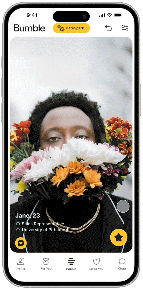
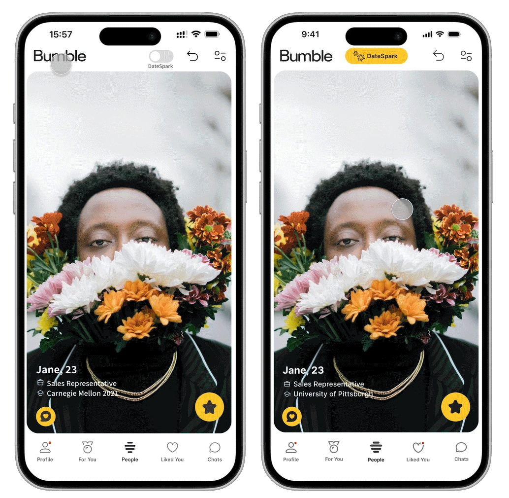
Here is the prototype of DateSpark Matching. As users swipe casually on Bumble, one would notice how Bumble only shows the profile person’s occupation and education at first glance. If the user would like to know more about how the profile person is compatible, the user would have to scroll down, read, and analyze. Then, the user discovers the DateSpark button which shows a little animation of how the user can swipe and enter the DateSpark matching mode. The user then proceeds to swipe and set first-time user preference. Once the preferences are set, a bee animation appears to highlight the change of mode. Now, instead of showing the typical occupation and education, the algorithm pulls people forward and shows aspects that the ML thinks make the user and the profile person a good match.
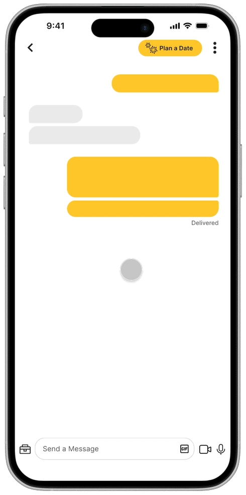
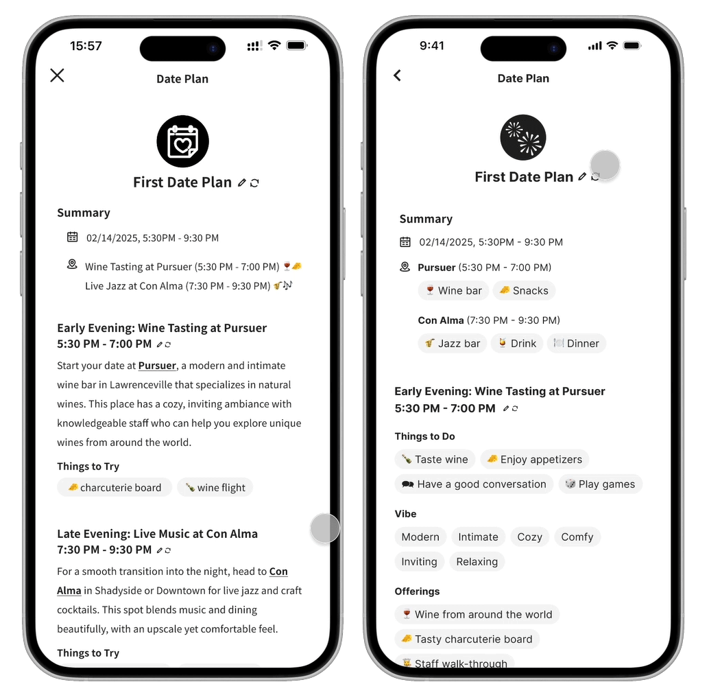
Here is how DateSpark Date Planning works for a non-premium user. The system detects that the users are planning to go out, which sets off the button-shaking animation to draw attention. Then, the non-premium user goes through a process of setting preferences to generate the plan. Users can re-generate plans or make edits. The desktop version allows both parties to edit the plan at the same time. Once the date plan is approved, it gets sent to the chatbox.

Play with the Prototype
Process and Design Evolution
Approach
I began the project by reviewing the existing design brief, which identified the low conversion rate of Bumble users to premium services as the problem. The brief proposed Precision Location Services as a solution, but my secondary research on dating app user preferences suggested that users have significant safety and privacy concerns with similar functionalities. With only 4.8% of Bumble users subscribing to premium services, I saw an opportunity to increase conversions by offering a feature that provides clear, tangible value thus incentivizing users to subscribe to premium services.
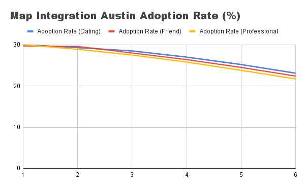
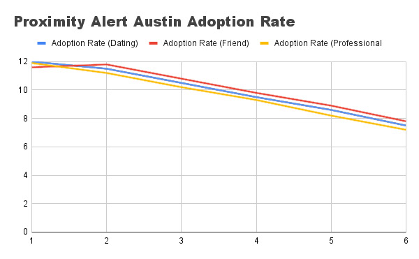
In addition, to better understand the problem, I analyzed Bumble’s data analytics on two previous features: Proximity Alert and Map Integration. The data revealed that:
○ Proximity Alert struggled with declining adoption rates and slow retention rate growth, likely due to privacy concerns and lack of perceived value.
○ Map Integration performed slightly better but still showcased a similar trend over time, indicating that users did not see persisting value in the feature.
These insights indicated the need for a feature that not only attracts users initially but also provides ongoing value to keep them engaged and interested in premium services.
Concept Development
With these insights in mind, I brainstormed three preliminary concepts:
1. First Date Suggestion:
An algorithm that analyzes user profile information, past conversations, behavior patterns, and location (if opted in) to suggest the best first date location, maximizing the chances of a successful match for premium users.
2. Conversation Assistance:
An AI assistant that helps premium users with conversations by suggesting topics, wording, and responses to keep the interaction engaging.
3. Profile Improvement:
A service that uses an algorithm trained on profile data and success rates to help users optimize their profiles for better matches.
Each concept had its own benefits and flaws. After discussing these ideas with classmates during critique sessions and some further research, Conversation Assistance seems to be less attractive and Profile Improvement lacks long-term value. Therefore, I decided to move forward with improving the First Date Suggestion concept, as it directly addressed the pain points of date planning and matching, which users often find inconvenient or challenging.
Design Evolution & Iteration
I moved on to fleshing out the user flow for the First Date Suggestion concept. As I progressed, I realized that the same machine learning model trained on dating app user data could be applied in multiple areas of Bumble to provide different services. So, instead of limiting the algorithm to activity-based date planning, I expanded its scope to include personalized matching and date planning, as my secondary research indicated that these were the areas where dating app users found the most value—or the most inconvenience.

I focused on prototyping the two most important yet somewhat "unbelievable" moments in the user flow: using DateSpark to match and using DateSpark to create a date plan. I want these moments to be intuitive, engaging, and reflective of Bumble’s playful brand identity.
First Iteration & Final Iteration
1. Switching to DateSpark Mode
Initial Design: My first iteration used a toggle button to switch between normal Bumble and DateSpark modes, with a full-bleed preference page.
Problem: There wasn’t enough differentiation between normal Bumble and DateSpark, and the preference page felt disconnected from the rest of the app.
Solution: I replaced the toggle with a button that triggers an animation showing how to switch to DateSpark mode. The preference page was redesigned to not cover the full screen, providing a sense of continuity. I also added a bee animation and a theme color-change during the mode switch to exaggerate and make it more engaging.
2. Date Plan Page Redesign:
Initial Design: The date plan page was text-heavy and dense, resembling a formal document rather than a playful dating app feature.
Problem: The plan page was overwhelming and uninviting.
Solution: I transformed the features of the date plan into bubbles of bullet points, aligning with Bumble’s design style. This also made the page more visually appealing and easier to read.
First Iteration & Final Iteration
3. Collaborative Date Planning:
Initial Design: My initial design for collaborative date planning was unclear. I did not fully think through the process.
Problem: The collaborative process was redundant and unclear.
Solution: For the mobile end, I allowed users to send confirmed date plan back and forth in the chat. In addition, I also incorporated cross-platform functionality, allowing users to work on date plans simultaneously via desktop.
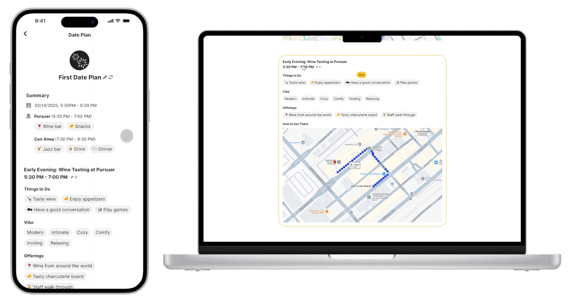
Final Date Planning Mobile & Desktop
Reflection
Working on the DateSpark project, I gained insights into the design process, from reframing the design brief to initial research to the final prototype mockup. Some of my biggest challenges include working with data, incorporating design systems, and creating my own Figma components. While this initially seemed like a daunting project, it also turned out to be a rewarding experience that walked me through a comprehensive process of design.
I learned so much about Figma: frame, auto-layout, smart animation, prototype flows, etc… I especially enjoyed the process of creating my own design components and animations. This allowed me to design and experiment with micro-interactions that enhanced the user experience. For example, the bee animation I added to the mode-switch button became a defining moment, making the transition to all the “hero moments” in DateSpark feel special yet coherent. I realized how much small details matter and began to appreciate micro-interactions that I underappreciated when encountered in the past.
Challenges and Solutions
1. Creating Data Analysis
Challenge: This was my first time using data analytics to inform design decisions, and it was initially overwhelming. Upon receiving the data analytics of Proximity Alert and Map Integration, I was confused and lost, not knowing where to even start.
Solution: I first googled each of the column titles to understand what the data means and what I can potentially infer from it. Then, I used chatGPT to give a few examples of how data analysis can be done and what inferences can be made from the data. After that, I moved on to creating my own analysis.
2. Incorporating Existing Design Systems:
Challenge: Adapting my designs to fit existing design systems was one of the most difficult aspects of the project. I completed the majority of my hi-fi prototype with my own components before I realized that I needed to incorporate the design system.
Solution: I spent some time studying the existing design system, understanding what components can be used to replace components I made. Then, I replaced my custom components with Bumble’s existing ones wherever possible. I also discussed with peers to see how they incorporated the design system components.
3. Creating Custom Design Components:
Challenge: I wanted to use animations to make DateSpark feel dynamic and engaging, but I struggled with deciding which animations to use and where to place them. I didn’t want to overdo it and risk making the feature feel gimmicky, but I also wanted to create moments that would enhance the user experience.
Solution: I focused on adding animations to key moments that needed user attention, such as switching to DateSpark mode and starting to plan a date. To ensure the animations felt cohesive, I used similar animations/techniques across DateSpark. This approach helped me to get to the right balance between functionality and enjoyment.
Future
If I were to revisit this project, I would plan better and stay lo-fi for longer before I move on to hi-fi prototype. I would also explore ways to further personalize the experience with ML algorithms to analyze. Additionally, I would make sure that my Figma prototype is more organized with auto-layouts and such.
Through this project, I learned to create meaningful and engaging user experiences with the intersection of technology and design. I want to keep applying the skills and insights I’ve gained to future projects.